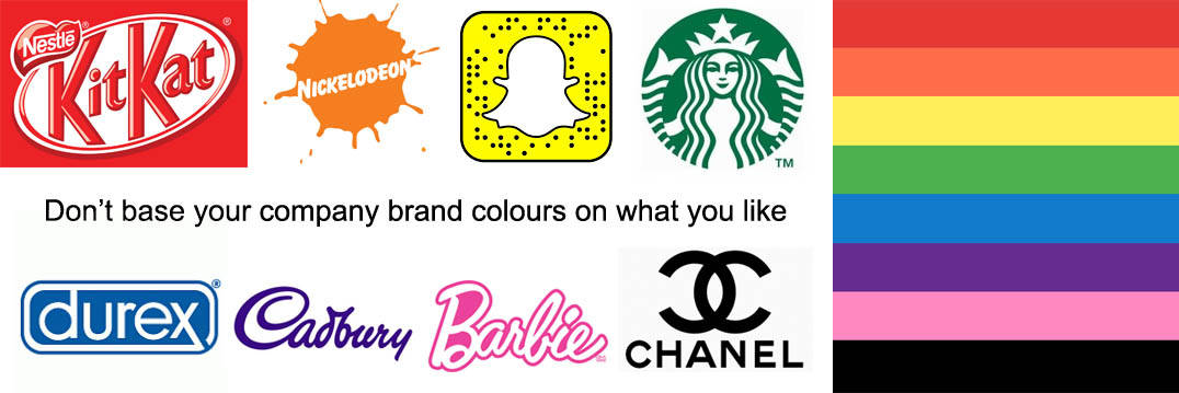
Your company’s logo is its most important design element, because it is the visual representation of the company values. There are many decisions to make when creating one, and one of the biggest is colour. It may seem to be a trivial element, but the main colour of each of these famous logos has a serious impact on how people perceive it.
Research has shown that people make subconscious perceptions about a person, place, or product within 90 seconds of initial contact. I mean that is shorter than it takes Usain Bolt to run 100 metres. Between 62% and 90% of that decision is based on colour. This means that your logo could make or break a person’s decision to become a customer.
It also means that as a consumer, your decisions about where to shop and what brands to trust are heavily influenced by logos, whether you realise it or not. We associate certain fonts, colours, and designs with qualities that are entirely unrelated, like product quality and reliability.
This may sound absurd, but if you’re a business owner or even a marketing professional such as the team here at golddust marketing, it’s absolutely necessary to consider your target audience’s values and personalities when creating your logo. And even if you aren’t involved in marketing, though everyone in your organisation should be to a degree, it can be interesting to consider what your favourite brands are trying to convey with their designs and colours.
So if you’ve ever found yourself wondering why so many fast food companies have red logos or what the Starbucks logo means, it essentially all comes down to the meanings behind those colours. Here is a break down on colour and the companies that use it.
RED – Powerful and Passionate: Confidence – Energy – Intensity
A red logo shows that your brand is powerful and high-energy. If your company is a restaurant, red is a wise choice. It’s been proven to increase appetite, which is ideal for a business that is trying to encourage food purchases. Its ability to increase heart rate is also good for brands trying to create urgency, like in clearance sales or for items that are typically impulse buys. Pass me a Kit Kat now!!
ORANGE – Playful and Enthusiastic: Excitement – Warmth – Creativity
An orange logo sends the message that your company is friendly and cheerful. This makes it a great choice for brands who want to be seen as light-hearted and not too serious. Who loves orange soda? Kel loves orange soda.
YELLOW – Fun and Friendly: Happiness – Optimism – Caution
A yellow logo shows your company as positive and friendly. It can be used to grab the attention of window shoppers and convey a sense of happiness. BUT shade is important – don’t put a strain on viewers’ eyes.
GREEN – Youthful and Earth-Friendly: Health – Tranquillity – Freshness
Green logo’s make you think a passion for the environment. This explains why it’s so popular with organic and health brands. It’s also embraced by companies that strive for ethical practices.
BLUE – Calm and Logical: Serenity – Stability – Peacefulness
If you want your brand to be professional and logical but not invasive then blue is your colour. Think about it most men and women when asked their favourite colour say blue – it has a lot of appeal. It can create a sense of trust and security in your brand. But think about it right now – do you ever see many restaurants or food sellers that go with blue?
PURPLE – Luxurious and Wise: Royalty – Wealth – Success
Luxurious, imaginative and almost regal – the subconscious thoughts from the colour purple. Great for luxurious brands to attract consumers who want to be seen as wealthy and wise or equally magical or mysterious.
PINK – Feminine and Sweet: Femininity – Warmth – Energy
If you’re targeting women there is a large chance you’ll have pink in your logo. Girly or sweet food products could be your product and you’re trying to be seen as a lively and fun company.
BLACK – Serious and Sophisticated: Elegance – Seriousness – Exclusivity
You’re not openly trying to attract attention with a black logo. Your company wants to be seen as well established, with a strong reputation and a sense of elegance. Your brand is part of what the consumer buys such as Chanel products.
Inspired? If you want to learn more about how colours shape opinions about your brand and business give us a call.


Leave a Reply
You must be logged in to post a comment.